Showing posts with label Research. Show all posts

Wednesday, 16 November 2016

Institution Logo Research

As Amy and I want to design our own logo for our production company (which we have named "Double A Productions"), I have decided to research some other film institution logo's to get an idea of what they should look like. Amy and I focused on Blumhouse Productions, Lionsgate and Hammer in particular as they are well known for producing professional and successful films.

From the research that Amy performed, we found out that whilst some institutions do not change the theme of their logo's, some adapt the colour or music they use wen producing a horror film in order to add to the atmosphere. In this case, the colours black and red are often used to make the logo appear much darker and more sinister.


An example of this is Lionsgate:


However, horror institutions keep their logo's the same as they only produced horror they use the colour conventions of horror to remind their audience of the films that they typically produced and develop.


Examples of this are Blumhouse:


And Hammer:


After researching, Amy and I have decided that we want our company to only create films and media products of the horror genre and we therefore aim to create a logo based on the codes and conventions of this genre.

Thursday, 3 November 2016

Research into Target Audience for Main Brief

The target audience for my horror film is people between the age of 15 and 25. At this age, people are in a vital stage of development and are finding ways of discovering themselves - they want to try new things and experiment with emotions and feelings. They are also gaining independence and are seeking a way to rush into life completely unaided. For them, horror films provide this thrill and excitement.

Horror films tend to be aimed more at males due to the use of graphic violence and horror that may be off putting for girls. Boys are often seen as thrill seekers who are contesting with their young adult hormones. Horror films therefore tend to be much more attractive to men rather than women. However, we are aiming to attract an audience consisting of both genres, we have attempted to do this by making our main character a female so that the female audience can relate to our main character.

Couples and groups of friends are more likely to go and see horror films as it provides excitement and thrills. Furthermore, couples that are on a first date are able to easily start a conversation and comfort each other after the film.

We are aiming at attracting the working and middle class members of society as they can easily afford to go to the cinema as a leisure activity and get a thrill out of seeing a horror film. They also cannot afford to do anything to extravagant or expensive.

The psychographic of our target audience are mainstreamers. This is because they follow the latest trend and have the money to go to the cinema and eventually by the DVD or Blu-ray when it is released.

Image result for horror film  audience

Image result for horror film target audience

Textual Analysis: The Ring 2

The film opens with the DreamWorks logo, a production company that is very popular and well known meaning the audience will immediately recognize the company. The screen then changes to show crashing, ominous waves, that are matched with a suspenseful and dark non-diegetic sound. The screen then goes black before showing much calmer water. Once again, the screen fades to black before panning over rolling waves that fade out to black again. The scene then cuts back to the reflection of the moonlight on waves before it fades to white, before revealing a dark blue blank screen before panning down to reveal a city, making the audience feel at ease because they realize the film is not set in an isolated area, meaning there is help nearby.


The shot then fades into an establishing shot of a small house just as a car drives past, representing normality. This then cuts to a pan through a living room, showing the comfortable and traditional furniture. The shot also shows the back of a girl who is sat on the sofa. There is then a close up of the girls ear just as someone whispers in her ear. The music fades out as the shot changes to a mid shot, revealing a young blonde girl as she turns to face a dark haired male. The shot then cuts to a zoom in on the males face as he says "I want to show you something." Shot reverse shot is then shown to reveal the girls reaction as she takes in what the male said, implying to the audience that she is confused and worried.


A tracking shot is then used to follow the male as he moves to sit next to the girl on the sofa. This shot is used to focus the camera on the TV, keeping the characters out of focus meaning the audience's attention is focused on the TV. A mid shot is then used to show the couple as they talk before the shot pans and gives the audience a sense of foreboding as the male says "have you ever seen something so scary, you had to show someone else?" The camera then pans out to focus on a tape on a table as the couple talk, emphasising the importance of the tape and hinting at what is going to happen. The male then reaches for the tape, confirming the suspicion that the tape is of high importance and is what the male had been referring to as "the scariest movie ever", making the audience completely aware of what is about to happen.


The camera then follows Jake's hand back into a mid shot of the couple, before changing into a zoom in of the couple and then of the male, who appears very tense and determined as he tells the girl "you need to watch this now." A zoom in is then used to show the female appearing very uncomfortable and reluctant, echoing the audience's reaction as they know the girls fate. Match-on-action is then used as the girl takes the tape off the male and the shot changes back to a mid shot of the couple as Jake kisses Emily, implying that he is sorry for what is about to happen, further increasing the audiences suspicion of his character. There is then a zoom in on Emily as she watches her companion leave the room, before an eye match shot watches him leave the room appearing guilty and nervous as he runs his fingers through his hair, scratching his head, further increasing the audiences suspicion of his guilt.


A zoom in on the girls face then pans down to the tape in her hands, making it extremely obvious for the audience that this tape has a lot of power and that it will drive the narrative of the entire film, not just this opening sequence. Suddenly, it cuts to a door opening in a close mid shot and then a tracking shot as Jake enters the room and appearing distressed as he checks the time, a close up revealing it to be 10:58 pm. The audience get a sense that Jake is distressed and petrified about something, which is clearly demonstrated by the dialogue used.


The shot then cuts to the reflection of Emily in the TV as she walks towards it with the tape in her hands. A mid shot is then used to show the girl as she kneels down in front of the TV, before showing a zoom in of her putting the tape in the player - emphasising that there is no going back and that Emily is going to seal her own fate and watch the tape; this is also exaggerated by the intense and dramatic music used to build the scenes tension. A zoom in then shows the reflection of Emily's face in the TV just before a blue static fills the screen.


The scene then cuts to a zoom in on Jake before panning down as he pulls his sleeve up, revealing a red, bruised hand print on his arm. A zoom in is then used to show the obvious fear in Jake's face as he realises he is running out of time. A mid shot then shows Emily scared as she sits down on the sofa and picks up the TV remote. Match-on-action is used to transition the shot into a close up of the TV remote, to once again make the audience aware that there is no going back anymore. The screen then cuts again to show a close up of the digital clock on the microwave stating that it is 10:59. A fast, dramatic pan is then used to transition into a close up of Jake as he starts to appear even more anxious and distressed before he shouts out to Emily in desperation and raw fear to "play the goddamn tape" whilst walking towards the kitchen door. This makes the audience feel a small amount of sympathy for Jake as they realise he is only making Emily watch this tape as he is terrified that he is going to die.


A zoom in is then used to show Jake's reaction as he hears the recognisable eerie sounds of the tape, his face only displaying emotions of terror and recognition. The eerie sound effects used further builds the tension in the scene, making the audience feel even more on edge and making them anticipating the horror that is to come. Jake then turns around, match-on-action is used to change to a medium long shot as he walks over to the counter, still appearing tense but slightly more at ease as the camera zooms in on his face.


An over-the-shoulder mid-shot is then used to show the back of Emily as she watches a very cool toned scene on the tape of a woman brushing through her hair. The coldness of the image demonstrate the comfortableness and displeasure that anyone watching the tape can experience. The shot then switches to a long shot of Jake, with the landline phone in the left hand corner out of focus. This shot uses deep focus to give the audience an idea of the amount of space that there is in the house. The phone then starts to ring; the sound appears diegetic, making the audience believe that it is actually ringing and to make the sequence appear more realistic and relatible. A zoom in is then used to show an expression of knowing but also fear on Jake's face, making the audience believe that he may be aware of exactly what is going on.


A montage of scary, cold and dark clips that feature the same woman who was previously brushing her hair are used to try and scare the audience, but also to build up the tension and remind the audience that Emily is close to watching the climax of the video. A close up then focuses on the phone with Jack in the background as it continues to ring. The focus then shifts to Jake as he walks towards the phone and the focus shifts once again to the phone as Jake picks it up from its holster. A zoom in is used to demonstrate the obvious relief on Jake's face as he is told "you made it...I knew you'd make it through."A midshot is then used to show Jake as he slides to the ground in relief and comfort in the idea that whatever was distressing him is not up to the "stupid chick" from his school (Emily). The phrase he uses to describe Emily - the girl who he has now passed his curse onto - makes the audience feel resentment towards him as he has used an innocent person to save himself.


A midshot is then used to show a dark liquid or mist coming under the door, implying that maybe whoever called Jake spoke too soon. A midshot is also then used to demonstrate Jake's pure panic as he stands up after noticing the darkness spreading across the floor. The music gets more intense, suggesting that Jake is not as safe as he believed and that something absolutely terrible is going to happen. A tracking shot is then used to follow Jake as he walks over to the darkness and stands in it. This shot then transitions into a zoom in of Jake's feet as the darkness leaves an empty ring around them. This cuts to a zoom in of Jake's face, which is expressing pure terror as he starts to realise exactly what is happening. A midshot is then used to show Jake as he steps out of the darkness and quickly leaves the room.


As Jake enters the living room, a POV shot is used to show that Emily is still sat on the sofa, her body and face pointed in the direction of the TV screen. However, as Jake moves around the sofa, he and the audience realise that whilst the tape was playing, Emily had her eyes covered the whole time and "didn't watch". A zoom in is used to present a look of pure terror on Emily's face as she removes her hands from her face, just as the music gets even more intense and dramatic.


An over the shoulder shot is then used to show Jake glancing at the TV screen which displays a very cool toned, dark image of a well in the middle of a forest in what appears to be winter due to the absense of leaves on the trees. The use of a cold colour palette and the wintery scene make the audience feel cold and therefore much more affected and scared by the film than they would be if warmer colours were used.


Jake then falls to his knees in front of the TV - an action that is represented in a midshot. Around him, the living room starts to fade out with static breaking up the scene, as though Jake is being pulled into the TV. This effect continues by making Jake appear slightly transparent as the camera pans down to the top of the well. Intense, dangerous and loud music starts to play just as a hand reaches out of the well. This is followed by another, and then a dark haired girl as she pulls herself out of the well and starts to walk towards where Jake was previously knelt. Jump cuts are used to suggest that this girl has some form of supernatural powers, granting her the ability to perform teleportation type movement.


A zoom in is then used to sure the pure terror and fear that covers Jake's face as he realises that this is his fate, and he can no longer escape. Another montage of scary clips is then used to add to the incredibly high tension before a zoom in is used to show Emily as she screams in pure fright and fear. The screen is then filled with the same blue static as was shown on the television screen before cutting to black, with a glowing white ring appearing in the centre, referencing to the films title The Ring. Sinister alien like music is used to support the films supernatural genre.


Tuesday, 1 November 2016

Credit Font Questionnaire and Responses

Two weeks ago I published a questionnaire on different fonts and colours for horror film opening credits on my facebook page. I received 7 responses for this questionnaire which has given us an interesting outlook on the types of credits people expect to see when watching a horror film.

Here is the form that I submitted:


We received the following responses:


From this we can see that the participants favourite fonts were My Imaginary Friend and Crucifixion. Audiences also expect to see the opening credits in a red font which matches the original idea that Amy and I have for our brief. Finally, we learnt that most people expect to see the credits after the opening sequence. However, as part of our brief we have to have our credits in our opening sequence, so whilst we have taken this feedback on board we are not going to be able to adapt our brief to fit this idea.

From the responses that both of our questionnaires got, Amy and I will combine our answers and attempt to come up with a final design for our credits, which we will post on our blogs in the next few days.


Monday, 31 October 2016

Main Brief: Research For Music

Music is one of the most important aspects of a horror film as it helps to create a specific atmosphere or mood for the scene. An effective use of music helps to promote a reaction and emotions from an audience. Music also helps to make the film more enjoyable for the audience and helps to enhance and develop the experience that the audience have with the film. Music also helps to highlight specific scenes and parts of films to the audience. It can also help to hint at the audience what is to come.


Psycho:

The Pyscho soundtrack uses string instruments to create a fast, frightening and powerful theme. This theme adds both speed and intensity to the film, creating feelings of excitement and fear from the foreboding sounds. Benard Herrman's striking score manages to strike something primal in the audience, much like John Williams did with the Jaws soundtrack.


The Exorcist:

Mike Oldfield's track "Tubular Bells" was used for The Excorist's soundtrack. The sliced up pieces of orchestral music and the track create the freaky collection of sounds that terrified audiences when the film was originally released.


Music for our Main Brief:

In our main brief, we want to create an atmosphere of tension and excitement like most horror films manage to. We want to start with a calmer tone and build up to the climax of the film where the music will be the most tense. The most powerful piece of music will be used at the end when the audience first see the Entity as it will create a slight jumpscare for the audience and make them realise that they have been introduced to the films antagonist. There is no dialogue in our opening sequence, so we will be using lots of music and sound effects to create the atmosphere. The majority of these sound effects will be non-diegetic as we will have to add them in, however some of the sound effects will be diegetic to make them sound more realistic.

Main-Brief: Make-Up Research

In our main brief, both our protagonist and our antagonist will be wearing makeup in order to achiever the look that we want them to have. Whilst our protagonist will be wearing very natural and minimal makeup in order to reflect the idea that she has been sleeping, we want our entity to appear evil and dead, so I have been researching different makeup ideas in order to achieve this look. After researching, I found the following looks:


Image result for ghost makeup


Wednesday, 19 October 2016

Opening Credits in Horror Films


The Conjuring

The Conjuring's credits appear over black and white family portraits, newspaper clippings and photo negatives that are being presented by an unknown lecture. As the sequence continues, dark shadows appear over the images and clippings, revealing something that the audience may find troubling. The music used in this opening will result in the audience feeling uncomfortable and frightened of the film that is to come.

The font is a simple plain white font that stands out against the dark backgrounds in each of the images and media pieces presented to the audience. This makes it easy for the audience to read the credits but does not distract from the eerie and creepy atmosphere opening sequence develops.

Image result for the conjuring opening titles

The Shining

An aerial view of a deep valley shows towering mountains, forests and lakes in a wide-angle lense. The camera sweeps across the landscape before focusing on a tiny yellow Beetle driving up a winding road in the steep mounting cliffs. As the camera tracks the car, keeping it in a small area of the frame, demonstrating the size of the car compared to the size of the mountains and the valley. The aerial shot of the valley and the lack of towns and houses nearby strengthens and develops the themes of isolation. These opening credits envision the directors view of horror with an unnerving score combined with an intimidating landscape and themes of loneliness and isolation touched upon.

This title sequence goes against the usual codes and conventions of horror by avoiding using blood, gore and darkness. This opening title sequence links with themes that are later addressed in the film. The lonely mountain road is the first of many labyrinth constructs that the film forces the Torrence family into. The titles also link to the themes that remain dominant throughout the duration of the film: abuse, alienation and paranoia.


Opening Credits in Films

In films, the opening credits are shown at the very beginning of the picture and usually list the most important members of the production team. They are usually shown in a text that represent the films genre and are shown over a blank screen, static pictures or even over the film itself. The opening credits of a film usually include the following:


Stranger Things Opening Credits:

Image result for stranger things opening credits

The opening titles of Stranger Things - a Netflix original show - feature a white font over a black background that has red, glowing lines which make up the shows title. This adds to the confusion and the mystery that the show is based around and gives the credits a modern, eerie look.

Spectre Opening Credits:


Image result for spectre opening credits


The Opening titles of Spectre are shown over multiple slowly moving images the reveal aspects of the story's plot to the audience. The colours used in the moving images are dull other than the orange in the flame, this makes the film appear more serious and slightly mysteious.

The credits themselves appear in a white font, which the names capitalised and slightly larger than the roles the people played. This draws the audience attentions to the persons name, but does not withdraw the audience's attention from the images shown as the font is not overly bold or big compared to the images.

Horror Movie Opening Credits:

http://www.watchthetitles.com/articles/0096-Silent_Hill

http://www.watchthetitles.com/articles/00257-Silent_Hill_Revelation


Tuesday, 18 October 2016

Main Brief: Font Research for Credits

In our Brief, we want the font to represent the paranormal genre. In order to do this, the font has to be quite wispy and smokey to portray the idea of ghosts and something that is not fully in our world.

I went on some font sites and searched for fonts based on ghosts and horror and came up with these potential fonts that we could use for our credits and title. 

Fonts from www.myfonts.com :


Fonts from www.fontspace.com :


I picked my favourite of these fonts and turned the font red and placed it over a black background to see how effective they would look in our brief:


My favourite's of these four fonts was the 'Ghost Reverie' and 'Crucifixion', however before I decide to use this in my Brief, I am going to send out a questionnaire to give my potential audience a choice between these three fonts and to get an idea of what colours and themes they expect to see in paranormal horror credits. 

Link to Questionnaire:

https://docs.google.com/forms/d/1bcnqcQ2kghlscrFK3U9OSt8cTQIH53Zp3Iwb1UXNqpw/edit

Monday, 17 October 2016

Audience Theory

The Effects Theory

The theory that media texts have an effect or influence on the audience. It is normally considered that this effect is negative. The audience is passive and powerless to prevent influence. The power lies with the message in the text.

Image result for the effects theory media

An example of this is how reality shows such as The Only Way is Essex and Geordie Shore portray the people who live in these areas - giving the rest of society a negative view on the area and all the people in it despite the shows only showing a tiny minority.

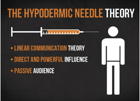
Hypodermic Needle

The messages in the text are injected into the audience. The media's message is like a drug.

Image result for the effects theory media

An example of this was in 1930, in America when Mercury Theatre and Orson Welles joined together and created a fake radio news show about aliens invading an American city. The programme was based on the book The War of the Worlds and was listened to by approximately twelve million people, one million of who completely believed it.

Bobo Doll Experiment

In the experiment:
- children watched a video where an adult violently attacked a clown doll called a Bobo Doll
- the children were then taken to a room with attractive toys they were not permitted to touch
- the children were then taken to a room with Bobo Dolls.
88% of the children imitated the violent behavior that they had earlier viewed, with 40% reported to have reproduced the same behavior eight months later.

Image result for bobo doll experiment

Stuart Hall - Encoding and Decoding

Hall argued that when texts are made they are encoded with a message by the institutions that suit the social, economical and political society that they are made in. The text is then received by an audience who decode the message and can interpret it in 3 different ways:
Dominant Reading: interpreted as the institute intended
Negotiated Reading: the audience may agree with some parts of the text but may disagree with other parts
or
Oppositional Reading: the audience may find themselves in conflict with the text and disagree. 

Image result for stuart hall encoding decoding

Uses and Gratifications Theory 

Blumler and Katz theorized that audiences are active and that actually the audience uses the text, rather than the text using the audience. The audience will seek out pleasure from the text so they will choose to consume it.

Pleasures and Gratifications can include:
- Escapism
- Diversion
- Information
- Counter Cultural Experience
- Comparing
- Sexual Stimulation

Image result for uses and gratifications theory media blumler katz

Main Brief:

From researching audience theory, I realise that as a distributor and producer, I am morally responsible for the reaction that the public have when this film is released. This means that I need to ensure as best as I can that my media product will be viewed as something for entertainment rather than inspiration for crimes or anything similar. This makes the certification of the film very important as if young people with vulnerable minds were to see disturbing and horrific scenes they may be too immature to realise that these actions or events are not supposed to be copied.

Tuesday, 11 October 2016

Audience Research: Questionnaire

In order to support the idea that our film should be rated a 15 as many young teens go to the cinema to watch and enjoy horror films, I designed a Questionnaire which I posted on my facebook page to gather a variety of responses.

From this, Amy and I realised our chosen certification was correct as 12 of the responses came from 15-18 year old's who go to the cinema on a much more regular basis than those over the age of eighteen. 

We also discovered that 11 of the 19 responses said that they liked paranormal horror, which led to this sub-genre being the most popular amongst the selection I gave. This makes us more confident in our idea and the popularity of our film when it is released. Similarly, 11 responses said they would expect the main character of a horror film to be a female, which confirms our assumption that the lead character should be female as they are portrayed as weak and vulnerable, and 12 said they would relate horror films to a house. This again increases our confidence in our ideas as we are giving the audience what they want and expect from a horror film. We also learnt that most people expect the opening of a horror film to take place at night, and for some form of action to be involved. As we had not planned to have any action in our opening, Amy and I will have to consider this when we script and further plan our idea.

Link to Questionnaire:

Monday, 10 October 2016

Case Study of Distribution: Paranormal Activity

Paranormal Activity


Paranormal Activity was made off a $15,000 budget and was directed by filmmaker Oren Peli. The film premiered at the Screamfest Horror Film Festival in 2007, before being shown at the Slamdance Film Festival a year later. Peli - who first gained a cult following in 2008 following the screening at the Slamdance Film Festival - caught the attention of Steven Spielberg. Spielberg originally wanted to direct a big-budget remake of the film and keep the original as a DVD extra, but he instead brought the film to Paramount.

The film had a limited U.S. release on the 25th September 2009 at midnight screenings in Los Angeles and 12 select college towns across the United States. Eleven of the twelve college town venues sold out. After these releases, the film evoked an unpredicted amout of demand at studios and local theatres, leading Paramounts co-presidents of marketing to team up with Eventful (an online calender and event discovery service) for a campaign that went against traditional routes. This was the first time a major motion picture studio used the service that Eventful provided to vitrually market a film.

This campaign meant that fans across the country could literally demand that the movie was screened in their area. The campaign therefore determined which markets Paramount would select for a series of midnight screenings. This was all achieved using a minimum of TV spots featuring reaction shots from audiences within the screenings and a small amount of radio and online adverts.

paranormal-activity-demand-it

Paramount aimed to advertise Paranormal Activity as an experience rather than just a film, they tried to avoid giving teasers of any of the horror involved in the film in order to entice the audience. This method appeared to work as the film grossed over $500,000 on the weekend of October the 2nd 2009, after being shown exclusively at midnight screenings in 12 markets, including 5 sold out screenings at Los Angeles' ArcLight theatre.
On October 6th, Paramount announced that if the film got over one million "demands" on Eventful, then the film would be released nationwide. On October 9th, the full limited release of the film started, and on October 10th, the film reached its target of a million requests on Eventful. Paramount announced that the film would get a wide domestic release on October 16th. The film was playing in theatres worldwide by November.

The film was released on DVD and Blu-ray on Decemeber 29th, 2009. The home release includes an alternate ending to the theatrical version and also featured 15 minutes' worth of names at the end of the film of the fans who "demanded" the film. The film was also released in the UK on Blu-ray and DVD on March 22, 2010.


Paranormal Acitivty grossed over $193 million internationally, and was followed by five other films following the same style and featuring Katie Featherson, who reprised her role as Katie throughout the series. Paranormal Activity 2 was release in 2010 and was set several weeks before the events of the first film, whilst Paranormal Activity 3 was released in 2011 and was set in 1988 and focused on a young Katie and Kristi - the main protagonists of the first two films. Paranormal Activity 4 was release in 2012 and based in 2011. Paranormal Activity: The Marked Ones was released in 2014 and follows a Latino community based in LA. The final film of the series, Paranormal Activity: The Ghost Dimesion was released in 2015 after an original release date of October 2013. The final installment of the franchise focuses on a family who discover several tapes that show Katie and Kristi in the midst of their initiation ritual to enter a denomic cover 21 years prior. This film featured a camera that can show unique supernatural happenings which the family use to record the paranomal activities that take place in the house.


Main Brief:

After researching the distribution of the Paranormal Activity franchise, I have decided that we would distribute our films to a single cinema company (e.g. Vue or Empire Cinemas) and set up a demand sheet online for fans of the horror franchise to ask for the film to be released to other film companies. We also plan to release the trailer online and as television adverts in the hope of gaining an audience. We also would want to release the trailer in all cinemas to be shown before other films of a similar certificate.

Thursday, 6 October 2016

Media Synergy

Synergy - When two companies work together to mutually benefit each other. 

Conglomerates - A company that owns numerous companies in various mass media such as television, radio, publishing, movies and the internet.

Synergy basically means working together to achieve an objective that couldn't be achieved independently. Synergy works when two different media conglomerates (or institutions) create linked products to promote each others product. Cross-media convergence can help with synergy if companies or institutions are wise enough to take advantage of the links they have formed.

Summit Entertainment Synergy Case Study - Twilight

Paramount had synergy with various companies after the release of Twilight in 2008. Multiple products were created off the Twilight saga (Twilight, New Moon, Eclipse, Breaking Dawn:Part 1 and Breaking Dawn:Part 2). These included:

- DVD release
- The original soundtracks
- Scene It? Twilight (Developed by Screenlife)
- Movie addition book covers
- Twilight Converse Shoes
- Twilight dolls
- Twilight clothing and homeware

    Image result for twilight soundtrack

Image result for twilight dvd

Disney Synergy Case Study

Disney is a great example of synergy as they often incorporate it and were the first company to properly use it. Disney has major theme parks that are used as large scale advertising tools, that they also base some of their film ideas on. The parks use characters from popular Disney films to promote people to visit the park, whilst the rides and attractions in the parks promote their films to visitors.

Disney also have synergy with Pixar - which is probably one of the most successful synergies you can find in the film industry, with over 10 full length feature films, with each of these films earning an average of $557 million, resulting in a grossing profit of  over $5.8 billion when taking the total of the films earnings and their budgets.


Top Grossing Disney Pixar Films
Release DateMovieProduction
Budget
Domestic
Opening
Weekend
Domestic
Box Office
Worldwide
Box Office

Nov 22, 1995Toy Story$30,000,000$29,140,617$191,796,233$364,545,516
Nov 20, 1998A Bug's Life$45,000,000$291,121$162,798,565$363,095,319
Nov 19, 1999Toy Story 2$90,000,000$300,163$245,852,179$511,358,276
Nov 2, 2001Monsters, Inc.$115,000,000$62,577,067$289,423,425$559,757,719
May 30, 2003Finding Nemo$94,000,000$70,251,710$380,529,370$936,429,37

Disney also worked in synergy with many companies to promote the release of Toy Story 3. They did this with:

- The Trailer
- The Digital 3D release of Toy Story and Toy Story 2 featuring the teaser trailer for Toy Story 3
- A Bluray/DVD combo release of the films including a 'making of Toy Story 3' feature
- Toy Story 3: The Video Game released by Disney Interactive Studio's prior to the film release
- ABC's (a broadcasting channel owned by Disney) Dancing with the Stars featured a performance from the film
- Sneak peeks of the film aired on Disney Channel
- Prior to the films release, Disney Channel had a 'Toy Story' day, where they aired the previous films and sneak peeks of Toy Story 3

Image result for toy story 3
disneygraph
